
It is incredibly important to have good navigation on your WordPress website. In this article, we’ll discuss the different types of main menus, and some navigation plugins you can use on your WordPress website.
We’ll look at the following types of navigation menus:
Some links in this article contain affiliate code.
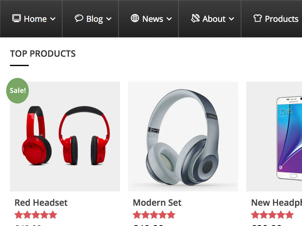
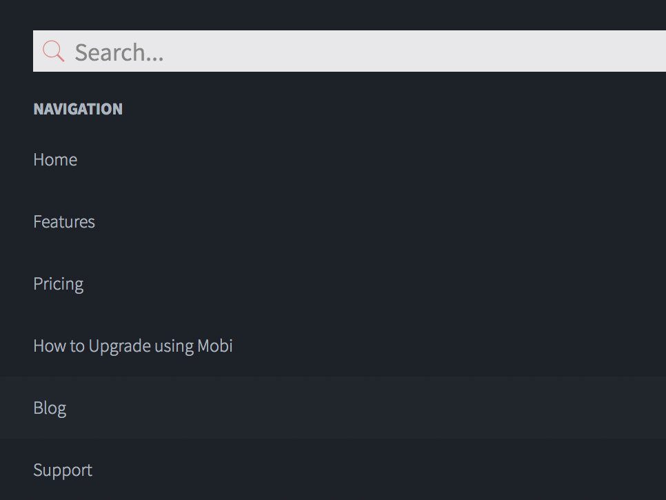
A default main menu on a website simply consists of a row of buttons, for example ‘Home, Services, About us, Contact’. Essentially all WordPress themes support a default WordPress menu (except for some one-page themes). So, there’s no need to install any extra plugins for this navigation menu.

Horizontal or vertical menu?
A default menu can be placed either horizontally or vertically. Horizontal main menus are very common in WordPress themes, but if you want a really nice vertical menu, check out the free WordPress theme TwentyFifteen. Do you want the option to change from a horizontal to a vertical menu and back? Then it’s best to choose another theme. Don’t want to say goodbye to your beloved theme and still want a vertical menu? The plugins below are really worth giving a try:
[av_one_third first min_height=” vertical_alignment=” space=” custom_margin=” margin=’0px’ padding=’0px’ border=” border_color=” radius=’0px’ background_color=” src=” background_position=’top left’ background_repeat=’no-repeat’ animation=” mobile_breaking=” mobile_display=” av_uid=’av-lvr44yj’]
Slick Menu ($ 25)
[/av_one_third]
[av_one_third min_height=” vertical_alignment=” space=” custom_margin=” margin=’0px’ padding=’0px’ border=” border_color=” radius=’0px’ background_color=” src=” background_position=’top left’ background_repeat=’no-repeat’ animation=” mobile_breaking=” mobile_display=” av_uid=’av-kf7953v’]
Morph Flyout ($ 18)
[/av_one_third]
[av_one_third min_height=” vertical_alignment=” space=” custom_margin=” margin=’0px’ padding=’0px’ border=” border_color=” radius=’0px’ background_color=” src=” background_position=’top left’ background_repeat=’no-repeat’ animation=” mobile_breaking=” mobile_display=” av_uid=’av-j28ts63′]
Superfly Menu ($ 25)
[/av_one_third]
A submenu is a menu that unfolds when you move your mouse over, or click on a main menu item. This gives you the possibility to include secondary menu items in your navigation menu that are not visible all the time. It keeps your main menu accessible and makes your layout more flexible. Plus, with WordPress you can create submenus for you website by just dragging and dropping.
Submenus are supported by almost all themes. Does your WordPress theme not support submenu? Below we’ll discuss a few plugins that can help you out.
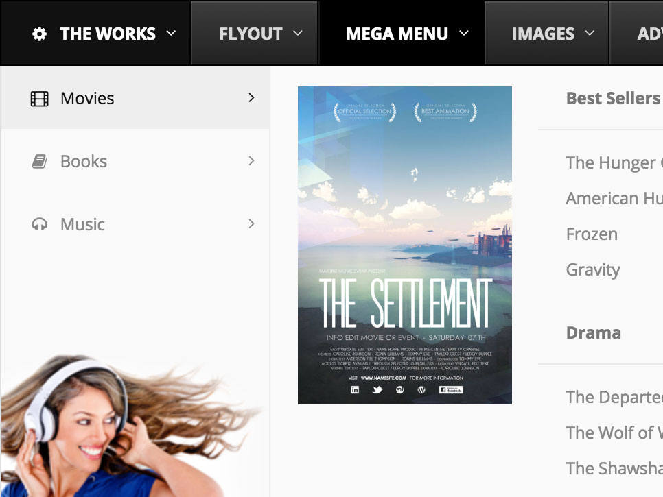
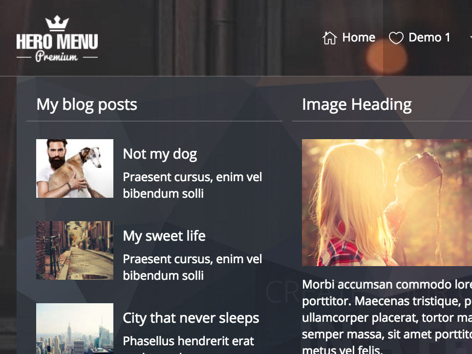
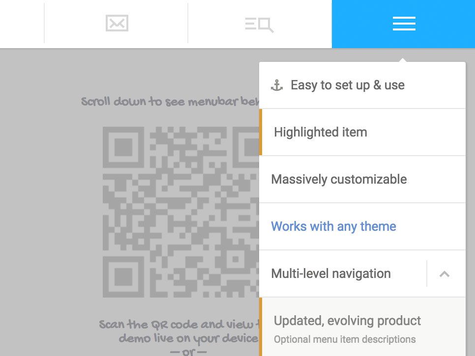
A default submenu consists of 1 column of items. A megamenu offers the possibility to divide items among several columns, sometimes even with titles over every column. Also, megamenus frequently provide additional display options for the unfolded spaces, like a piece of text, forms, images, video’s, Google Maps, etc. By using a megamenu, you’re giving visitors an attractive navigation.
Our three favorite WordPress plugins for megamenu functionalities are:
[av_one_third first min_height=” vertical_alignment=” space=” custom_margin=” margin=’0px’ padding=’0px’ border=” border_color=” radius=’0px’ background_color=” src=” background_position=’top left’ background_repeat=’no-repeat’ animation=” mobile_breaking=” mobile_display=” av_uid=’av-fdiy6jf’]
Ubermenu ($ 20)
[/av_one_third]
[av_one_third min_height=” vertical_alignment=” space=” custom_margin=” margin=’0px’ padding=’0px’ border=” border_color=” radius=’0px’ background_color=” src=” background_position=’top left’ background_repeat=’no-repeat’ animation=” mobile_breaking=” mobile_display=” av_uid=’av-e6q27sr’]
WP Mega Menu ($ 18)
[/av_one_third]
[av_one_third min_height=” vertical_alignment=” space=” custom_margin=” margin=’0px’ padding=’0px’ border=” border_color=” radius=’0px’ background_color=” src=” background_position=’top left’ background_repeat=’no-repeat’ animation=” mobile_breaking=” mobile_display=” av_uid=’av-cm99x23′]
Hero Menu ($ 19)
[/av_one_third]
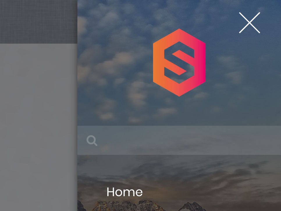
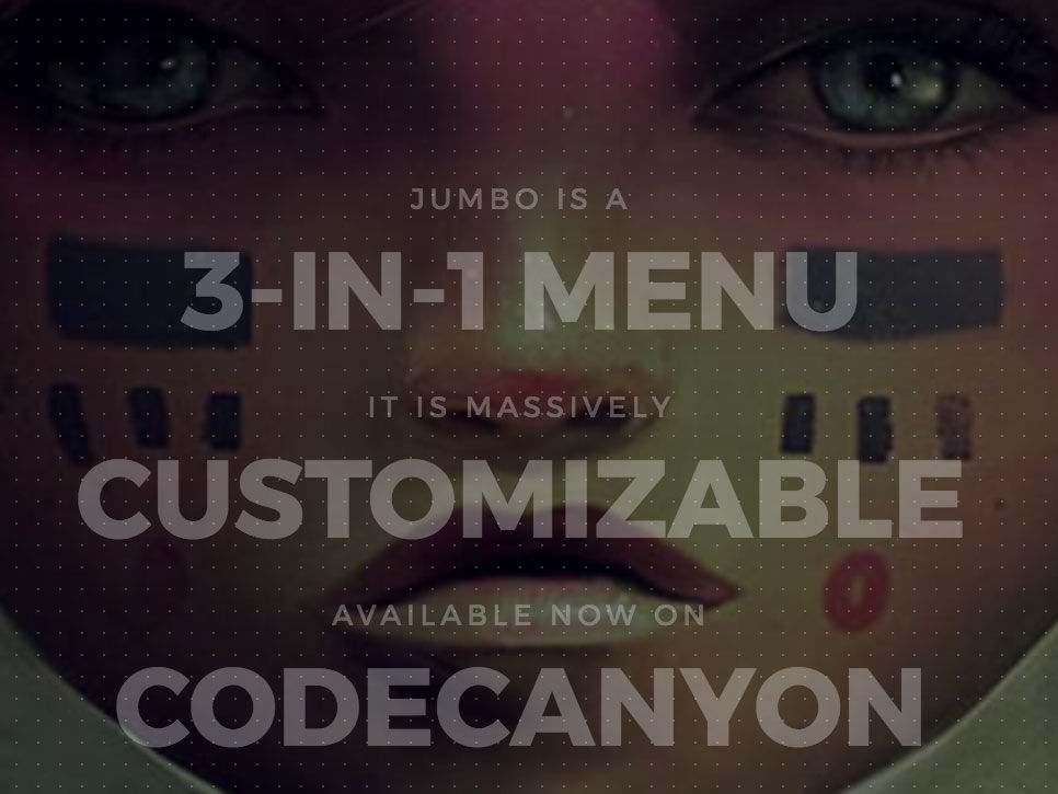
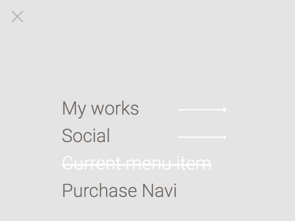
An overlay menu is not immediately visible, but appears when you click on a menu icon. The menu then covers the entirety of the screen. In this, an overlay menu looks very much like a mobile menu (see below), but it is also meant for larger screens. An overlay menu is useful when you don’t want the menu to distract too much when looking at the website, and vice versa, when the website shouldn’t distract while selecting something from the menu. Also, at times an overlay menu is used to make sure the user experience is the same on all devices, whether you’re on a mobile phone or on a desktop computer.
The following three plugins offer overlay functionalities:
[av_one_third first min_height=” vertical_alignment=” space=” custom_margin=” margin=’0px’ padding=’0px’ border=” border_color=” radius=’0px’ background_color=” src=” background_position=’top left’ background_repeat=’no-repeat’ animation=” mobile_breaking=” mobile_display=” av_uid=’av-9yrvry3′]
Jumbo ($ 18)
[/av_one_third]
[av_one_third min_height=” vertical_alignment=” space=” custom_margin=” margin=’0px’ padding=’0px’ border=” border_color=” radius=’0px’ background_color=” src=” background_position=’top left’ background_repeat=’no-repeat’ animation=” mobile_breaking=” mobile_display=” av_uid=’av-um64yj’]
DC Menu (free)
[/av_one_third]
[av_one_third min_height=” vertical_alignment=” space=” custom_margin=” margin=’0px’ padding=’0px’ border=” border_color=” radius=’0px’ background_color=” src=” background_position=’top left’ background_repeat=’no-repeat’ animation=” mobile_breaking=” mobile_display=” av_uid=’av-7cfkjkr’]
Navi Menu ($ 18)
[/av_one_third]
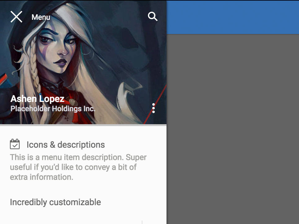
Obviously, your website should also (or especially!) work on mobile devices. Luckily, WordPress themes are almost all responsive, which means the screen width determines your website’s layout. Not only your website, but also your navigation menu should, of course, work properly on a mobile device. With the plugins below, you can make a separate design for your mobile menu and for larger screens (desktops and laptops). This may help improve the user experience, because you can give your mobile visitors just the menu items they need.
[av_one_third first min_height=” vertical_alignment=” space=” custom_margin=” margin=’0px’ padding=’0px’ border=” border_color=” radius=’0px’ background_color=” src=” background_position=’top left’ background_repeat=’no-repeat’ animation=” mobile_breaking=” mobile_display=” av_uid=’av-46rx5sr’]
TapTap ($ 21)
[/av_one_third]
[av_one_third min_height=” vertical_alignment=” space=” custom_margin=” margin=’0px’ padding=’0px’ border=” border_color=” radius=’0px’ background_color=” src=” background_position=’top left’ background_repeat=’no-repeat’ animation=” mobile_breaking=” mobile_display=” av_uid=’av-2uoowyj’]
Mobi ($ 16)
[/av_one_third]
[av_one_third min_height=” vertical_alignment=” space=” custom_margin=” margin=’0px’ padding=’0px’ border=” border_color=” radius=’0px’ background_color=” src=” background_position=’top left’ background_repeat=’no-repeat’ animation=” mobile_breaking=” mobile_display=” av_uid=’av-6h1k2j’]
Touchy ($ 20)
[/av_one_third]